How I Built a Tourism Website That Showcases a Serbian Thermal Spa
A thermal spa resort in southeastern Serbia had no modern web presence. I designed a fast, visually rich website that highlights the healing mineral pools, nearby attractions, and drives accommodation bookings.
View live site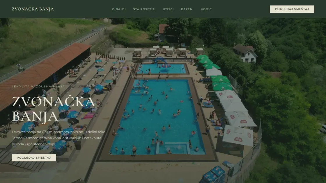
How does a modern website help a spa resort attract more visitors?
I built Zvonačka Banja a tourism website that showcases the resort's thermal mineral pools, surrounding nature, and nearby attractions in a way that makes visitors want to book before they finish scrolling. The site loads fast on any device, uses smooth scroll animations, and is structured to guide tourists from discovery to booking.
Zvonačka Banja is a thermal spa resort tucked into the mountains of southeastern Serbia, about 30 kilometers from Pirot. The resort sits at 670 meters elevation and features two indoor pools and one Olympic-sized outdoor pool fed by natural mineral water at 28°C. It also offers therapeutic treatments including hydrotherapy, kinesiotherapy, and laser therapy. Nearby you'll find Poganovo Monastery from the 14th century, Jerma River Canyon, and the Vetrena Dupka cave system.
The problem was simple. The resort had everything a visitor could want, but no modern website to show it. Potential guests searching online would find nothing that did the place justice. In tourism, if people can't see what they're getting, they go somewhere else.
What design decisions make a tourism website convert visitors into bookings?
I designed the site around one principle: let the place sell itself.
Aerial hero photography. The homepage opens with a drone shot of the pool complex surrounded by dense green hills. It immediately communicates what makes this place special. No stock photos, no generic spa imagery. This is the actual resort from above, and it looks stunning.
Visual sections that match the visitor journey. The page is organized the way a tourist thinks: first impressions, then what the resort offers, then what else is nearby, then testimonials from real visitors, and finally how to book. Every section answers the next natural question a visitor would have.
Smooth scroll animations. I used GSAP and Lenis to add subtle entrance animations as visitors scroll. For a tourism site, the browsing experience should feel relaxed and immersive. No jarring transitions, just smooth reveals that keep people exploring.
Dark, earthy color palette. The design uses deep greens and warm tones that reflect the natural mountain surroundings. Cormorant Garamond for headings gives it an elegant feel, while Montserrat keeps the body text clean and readable.
How did I handle performance with heavy imagery?
Tourism websites live and die by their photos, but photos kill load times. I solved this by building with Astro, which ships almost zero JavaScript to the browser. Combined with lazy loading and optimized image formats, the site loads fast even on mobile connections in rural areas where many visitors would be browsing.
The Swiper integration provides smooth image carousels for the pool gallery and nearby attractions without adding unnecessary page weight. Each carousel loads only the images currently in view.
I also built the site to be fully responsive. Over half of tourism searches happen on mobile, often while people are already traveling. The site looks and works just as well on a phone screen as it does on desktop.
What impact did the website have on the resort's visibility?
The website gave Zvonačka Banja a professional digital presence for the first time. Visitors can now see the pools, learn about therapeutic treatments, explore nearby attractions, and find accommodation options all in one place.
The site is set up with full SEO: meta tags, structured data for local business, a sitemap, and Open Graph tags so the resort looks great when shared on social media. For a local tourism business, showing up when someone searches "thermal spa Serbia" or "spa resort near Pirot" is the difference between full pools and empty ones.