How I Built a Fitness Platform Landing Page That Drives Waitlist Signups
A fitness startup needed a landing page that builds hype and collects email signups before their platform launches. I built a conversion-focused page with a countdown timer, feature previews, and social proof that turns visitors into waitlist subscribers.
View live site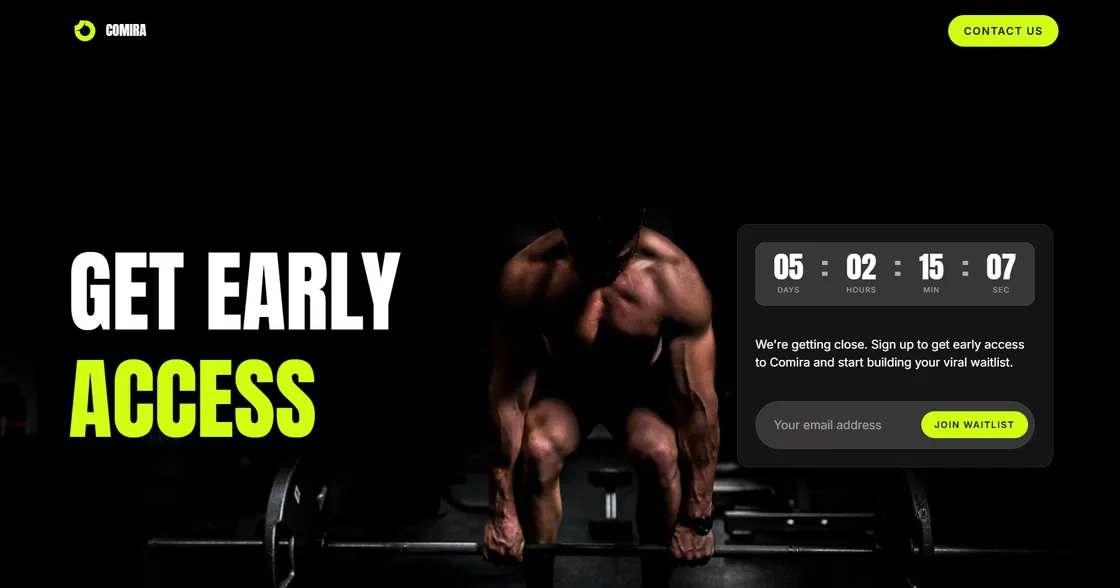
How does a pre-launch landing page turn visitors into early adopters?
I built Comira a pre-launch landing page that collects waitlist signups with a countdown timer, feature previews, and testimonials. The page was delivered in 3 days and loads in under a second on any device.
Comira is a fitness platform that brings personalized training, on-demand workouts, nutrition guidance, and progress tracking into one place. Before the platform was ready to launch, they needed a way to build an audience and validate demand. That meant a landing page that gets people excited enough to hand over their email address.
Why is the pre-launch phase so important for a fitness startup?
Launching a fitness platform to zero subscribers is the most expensive mistake a startup can make. Every day without a landing page collecting emails is potential users lost to competitors. Comira needed to start building their audience months before the product was ready.
The landing page does one thing well: it makes visitors want to be first in line. A clear headline, a countdown timer creating urgency, and an email capture form right in the hero section. No distractions, no unnecessary navigation. The entire page is designed around one action: join the waitlist.
How did I structure the page to maximize signups?
The page follows a proven conversion flow. The hero section leads with "Get Early Access" and a countdown timer that creates real urgency. Below that, a stats section highlights the platform's impact on member fitness goals.
The features section previews what subscribers will get access to: Personalized Training, On-Demand Workouts, Nutrition Guidance, and Progress Tracking. Each feature has a short description that focuses on the benefit, not the feature itself.
A testimonial section with real photos and quotes from early users adds social proof. People trust other people more than marketing copy. Seeing a real person say the platform changed their fitness journey is more convincing than any feature list.
The FAQ section handles objections before they become reasons not to sign up. Questions like "Is this for beginners?" and "Do I need special equipment?" remove friction for people on the fence.
What tech decisions made this page effective?
I built the page with Astro for maximum speed. A pre-launch page often gets traffic from social media ads where every millisecond of load time affects conversion rates. The page loads in under a second, even on slow mobile connections.
The countdown timer, testimonial slider, and email form are lightweight custom implementations. No heavy JavaScript frameworks, no unnecessary dependencies. The dark theme with fitness imagery creates an energetic, premium feel that matches the brand.
The page is fully responsive. Most fitness-interested users browse on their phones, so the mobile experience had to be flawless.
What was the result?
The complete landing page was delivered in 3 days. Comira now has a professional conversion-focused page collecting signups while they continue building the platform. The page sets the tone for the brand and gives them an audience ready to convert on launch day.