How I Built a Coaching Website That Turns Followers Into Booked Calls
A business coach for women entrepreneurs had a large social following but no home base to convert it. I built an elegant, fast website with a bold hero, clear program breakdowns, and strong social proof that makes booking a free call the obvious next step.
View live site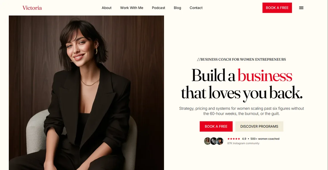
How do you turn a social following into paying coaching clients?
Victoria is a business coach for women entrepreneurs with a 87K Instagram community and hundreds of clients coached. She had the audience and the results, but no home base to send people to. Followers who were ready to invest had nowhere to go deeper, understand her programs, or book a call. I built an elegant, fast website that turns that following into booked discovery calls.
Why does a coach need more than an Instagram page?
Social platforms are rented land. The algorithm decides who sees you, and a follower who is ready to buy today can scroll past and forget by tomorrow. A website is the one place a coach fully owns. It works while she sleeps, ranks on Google, and gives serious prospects a professional space to evaluate her before they commit.
For Victoria, the goal was simple: give a warm follower the clearest possible path from "I like her content" to "I booked a call." Every section on the page is built around that single decision.
How did I design the hero to convert?
The hero does the heavy lifting. A confident, high-quality portrait sits beside a bold serif headline: "Build a business that loves you back." One line underneath explains exactly who she helps and the transformation she offers, strategy, pricing, and systems for women scaling past six figures without the burnout.
Two clear actions follow: a primary "Book a free call" button and a softer "Discover programs" option for people who want to learn more first. Directly below, a compact strip of social proof, a 4.9 rating, 500+ women coached, and the 87K community, removes doubt before the visitor even scrolls. The red accent against a warm cream background feels premium and personal, not corporate.
How did I structure the site around her programs?
The page follows a proven flow: hero with the promise, an about section that builds authority, a breakdown of her coaching programs, social proof from real clients, and a final call to action to book. Each program gets a short, benefit-led description so a visitor can quickly find the offer that matches where they are in their business.
I kept the copy focused on outcomes rather than features. Coaching is sold on trust and transformation, so the writing speaks to the reader's goals, more revenue, fewer hours, less guilt, instead of listing session counts.
What role does social proof play?
For a coach, proof is everything. Ratings, the number of women coached, the size of the community, and testimonials do more to convince a prospect than any claim she could make herself. I gave these elements prominent placement near every decision point, so trust builds continuously as the visitor moves down the page.
What was the tech stack?
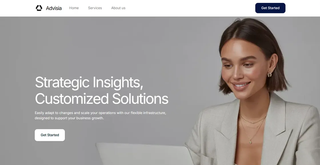
The entire site is built with Astro, which ships almost zero JavaScript to the browser, so it loads in under a second on any device. Scroll-triggered animations use GSAP, revealing each section smoothly as the visitor moves down the page, the same subtle approach I used on projects like Comira and Advisia.
The site is fully responsive. The hero portrait and headline restack cleanly on mobile, where most of her Instagram traffic comes from, so the experience feels intentional on a phone rather than shrunk down from desktop.
What was the result?
The full site was delivered in about a week, including the homepage, inner pages, and one round of design tweaks. Victoria now has a professional home base that matches the quality of her coaching, converts her existing audience into booked calls, and keeps working long after a post disappears from the feed.